WSIS + Better Dreams
Communicating the value of professional cooperation across agencies representing safe and healthy Nova Scotia workplaces.
Services: Brand identity and graphic design for print, screen, and environment
Product: Visual identity, icon suite, email marketing campaign, and event marketing materials
Client
Workplace Safety and Insurance System (WSIS) is a partnership of agencies that work together with Nova Scotia employers and workers to help keep the provincial workforce healthy and safe at work, insure against loss, and support workers’ rehabilitation.
wsis.ns.ca →
Team
Audrey Peters
Austin Mateka
Sheree Stephenson
Greg Dubeau
Working together for safer, smarter Nova Scotia workplaces
The Workplace Safety and Insurance System (WSIS →) unites Nova Scotia workers, employers, and key agencies—including the Workers’ Advisers Program (WAP →), Workers’ Compensation Appeals Tribunal (WCAT →), Occupational Health and Safety (OHS →), and the Workers’ Compensation Board of Nova Scotia (WCB →)—to promote workplace safety and support those affected by workplace injuries. Each year, WSIS hosts an annual meeting where all agencies come together to review performance and address key challenges for the year ahead. The 2024 meeting, themed “Building a Better System,” emphasized the importance of fostering psychologically safe workplaces.

Strategic branding for a multi-partner event
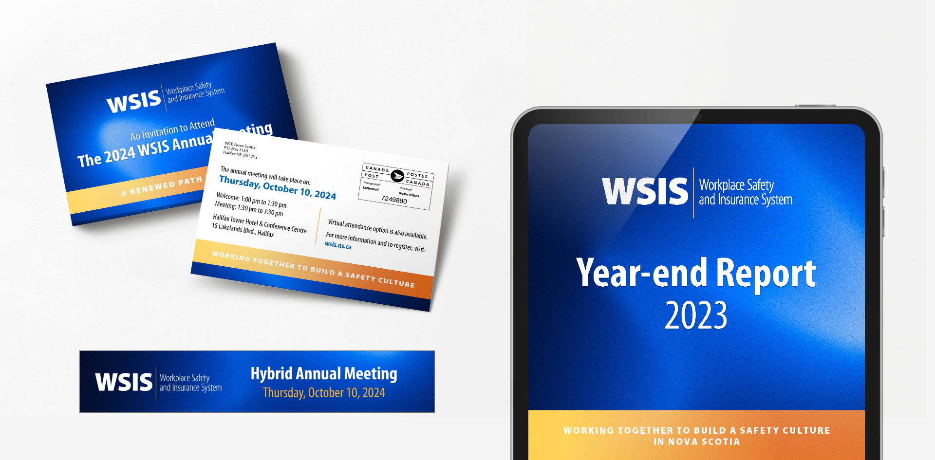
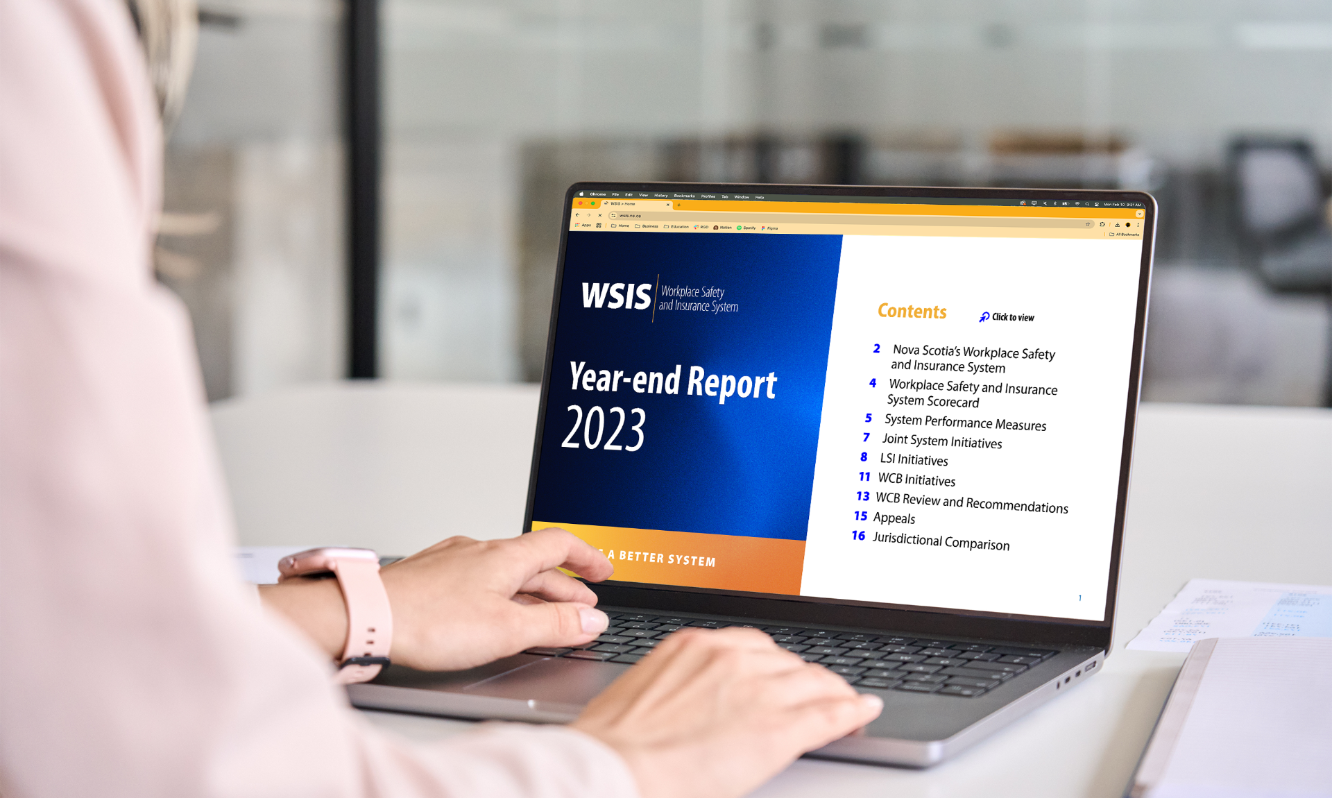
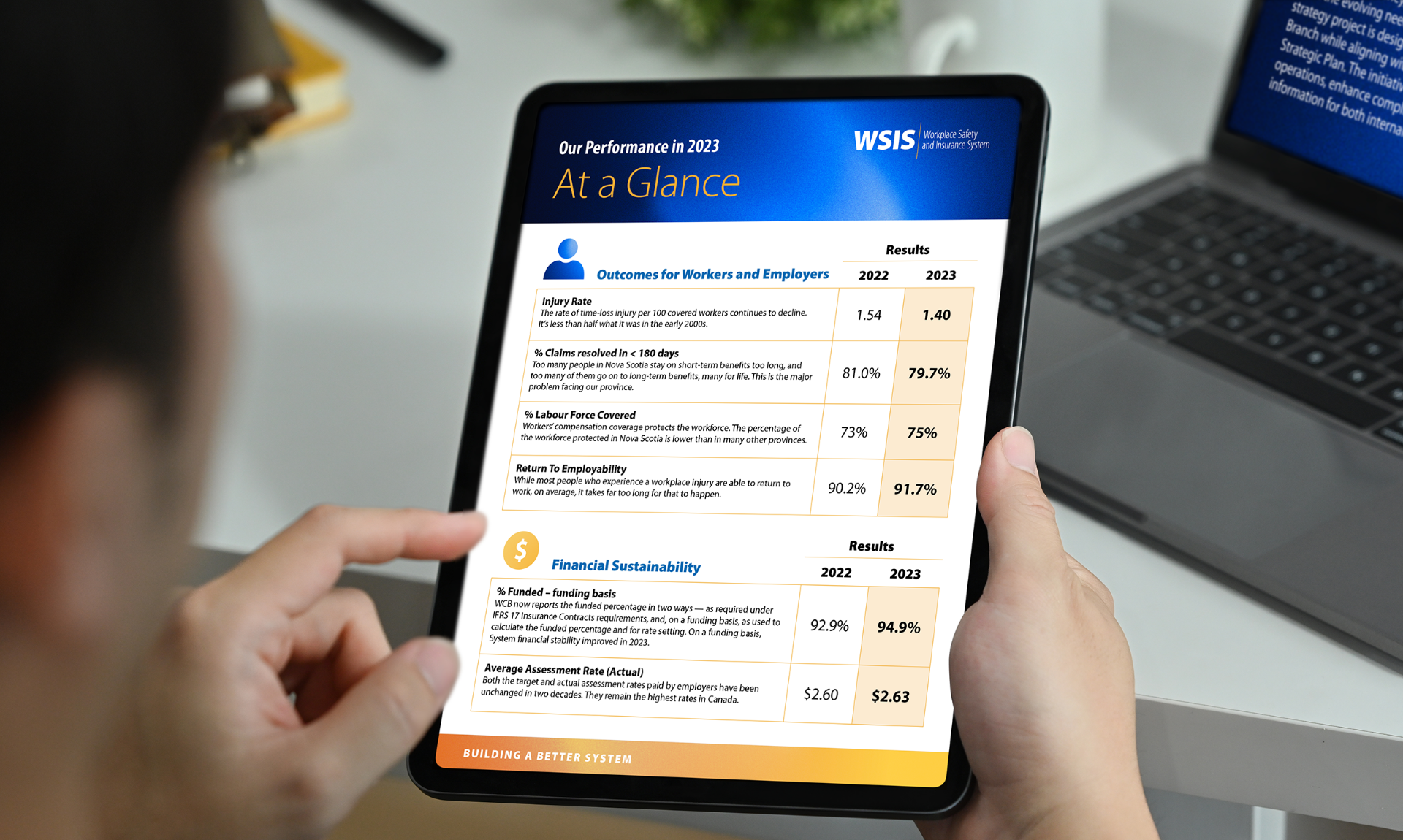
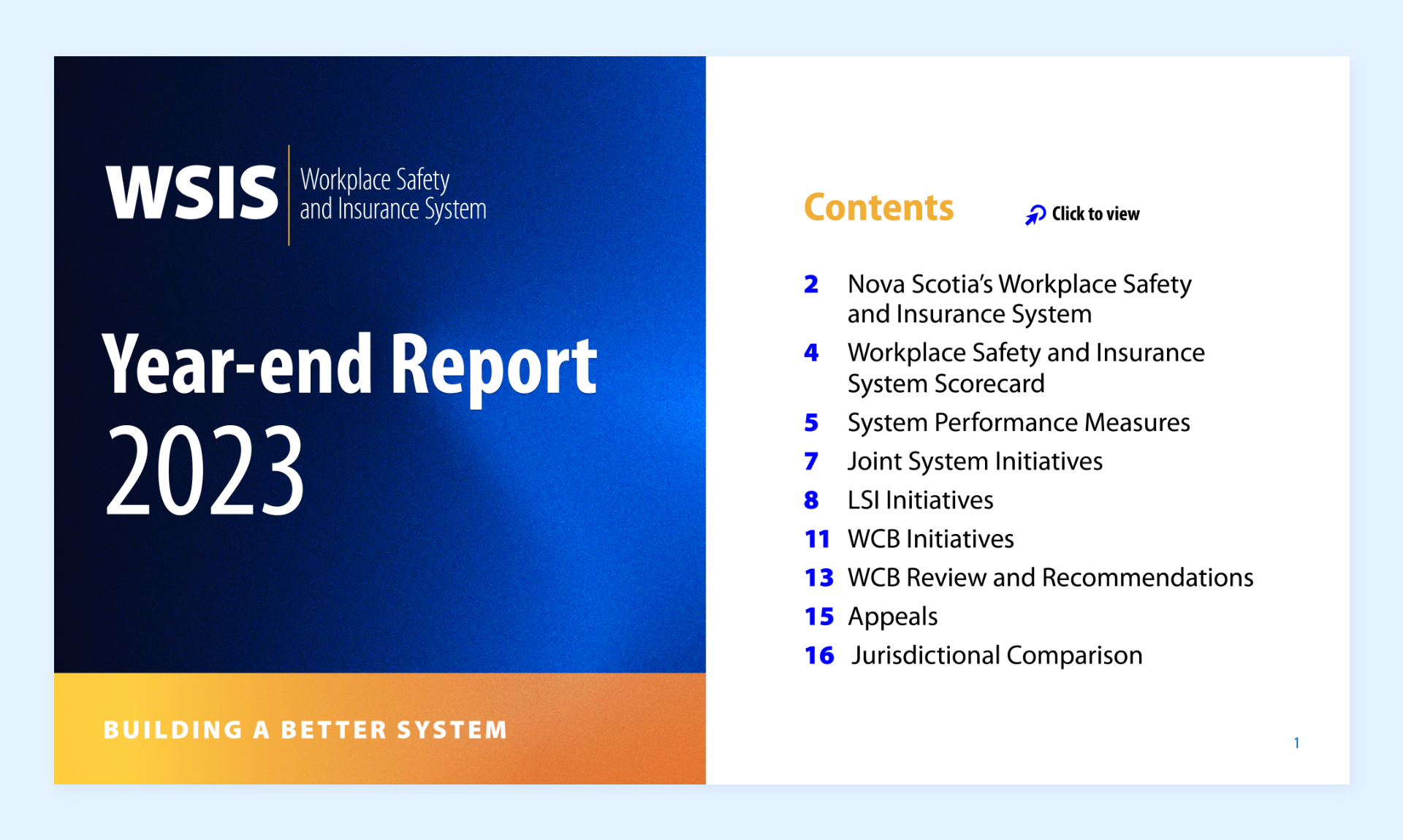
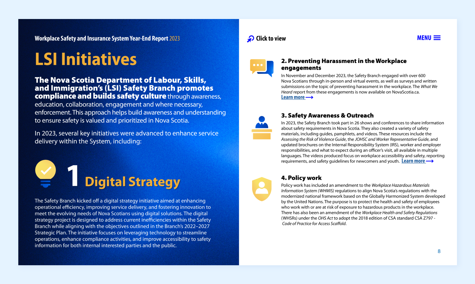
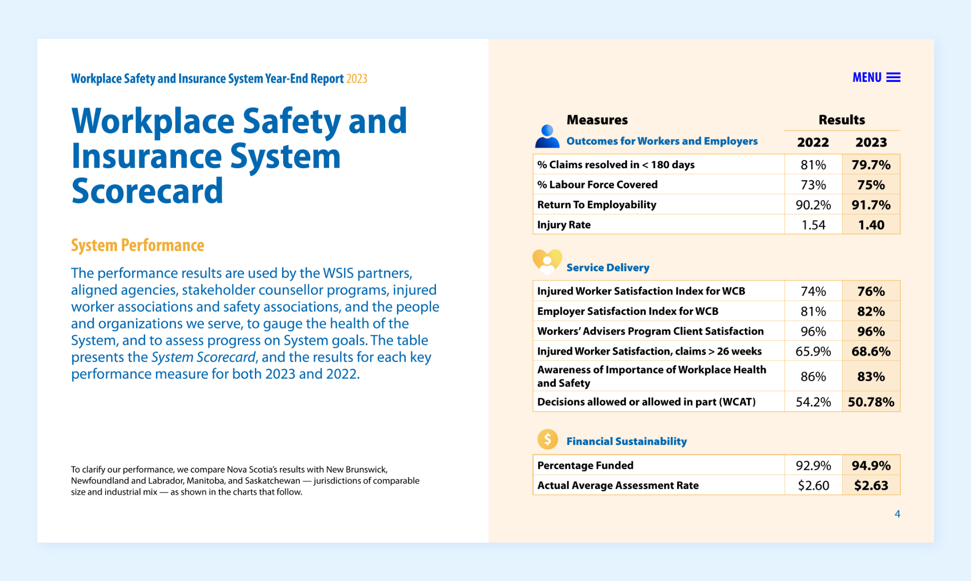
As a collaborative initiative, the annual event needed a distinctive brand identity that reflected the shared spirit of cooperation and innovation among participating organizations. The challenge was to create a flexible visual system designed with a digital-first mindset—one that thoughtfully applied semiotic theory to blend clean, intuitive iconography with strategic messaging and key data points.
Icons that enhance every touchpoint
A lively and versatile icon suite was created to bring energy and personality to the event’s branding. Designed for both dual-coded content and editorial use, each icon plays multiple roles, making them adaptable across marketing materials and event experiences. The central graphic texture from the hero branding was repurposed, adding a layer of depth and sophistication while keeping the overall look dynamic and engaging, which created a playful yet polished visual system that enhanced the annual meetings’ theme in a bold, flexible way.
